
Building an Open Design System for a Nonprofit Community
ForEveryone Berlin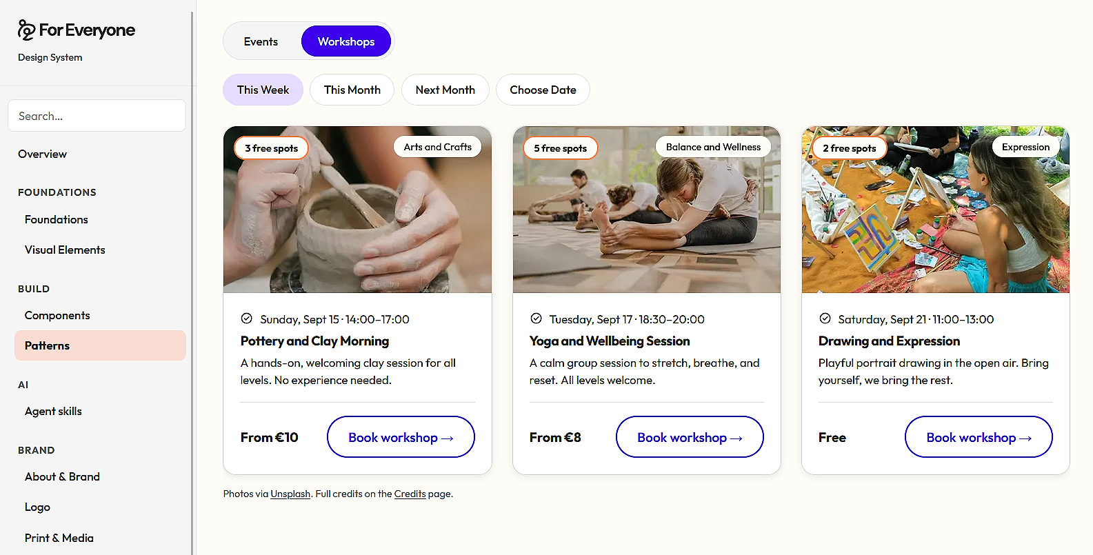
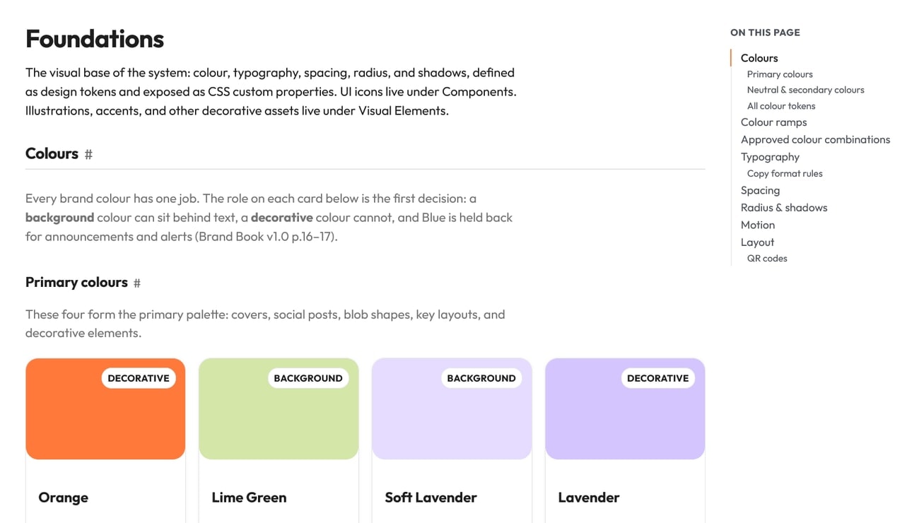
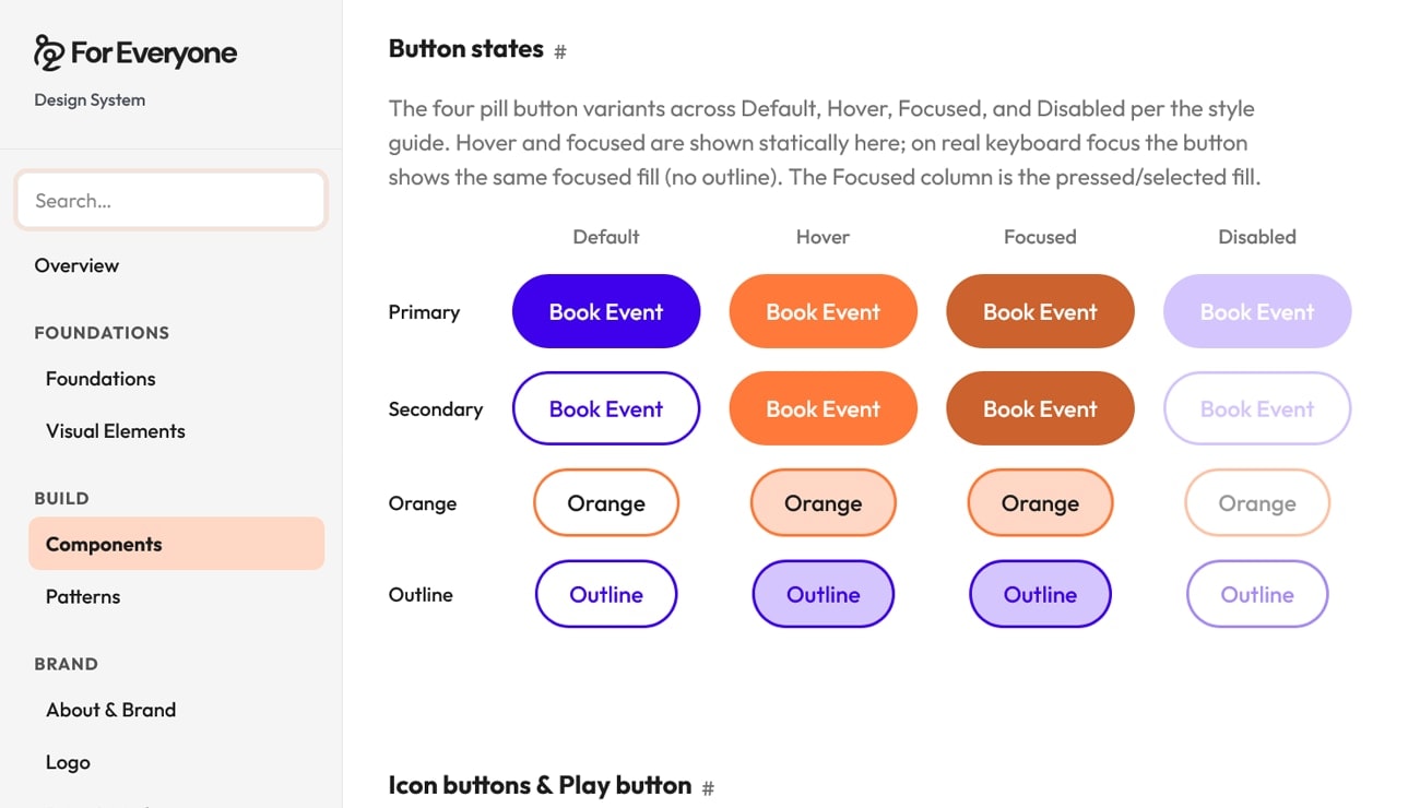
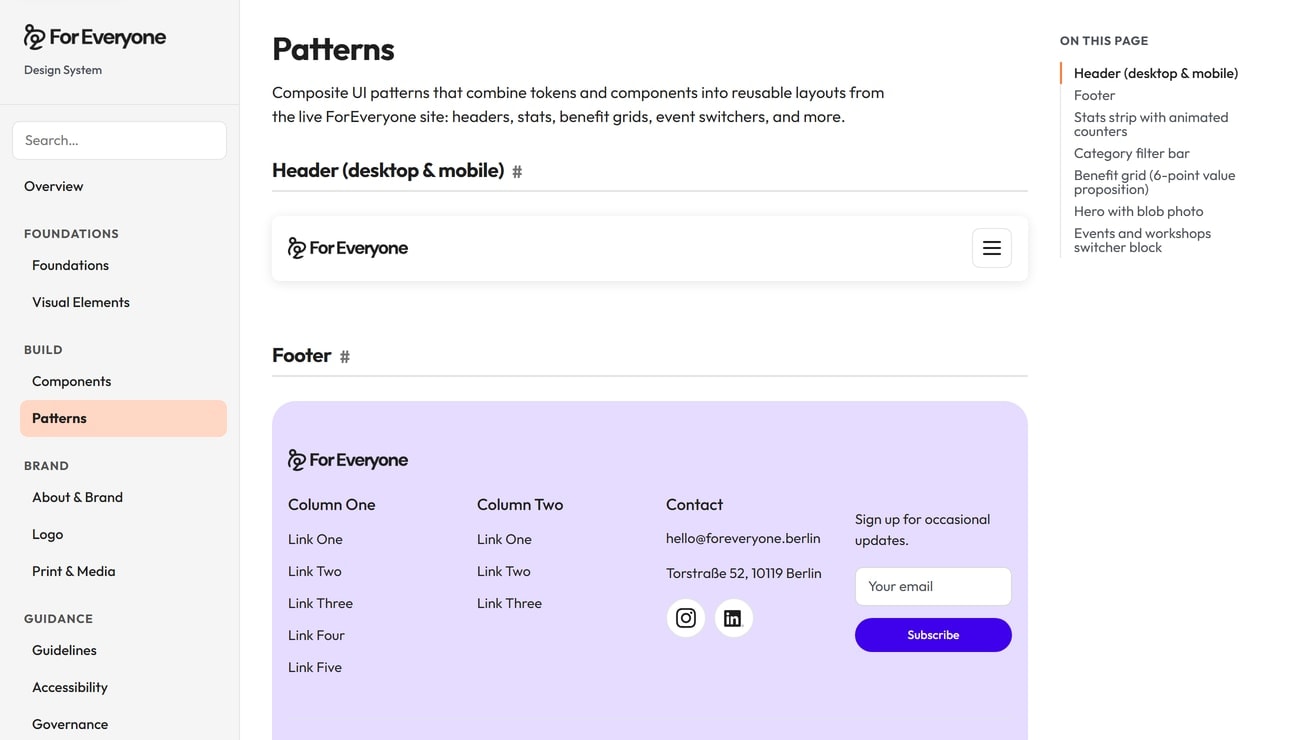
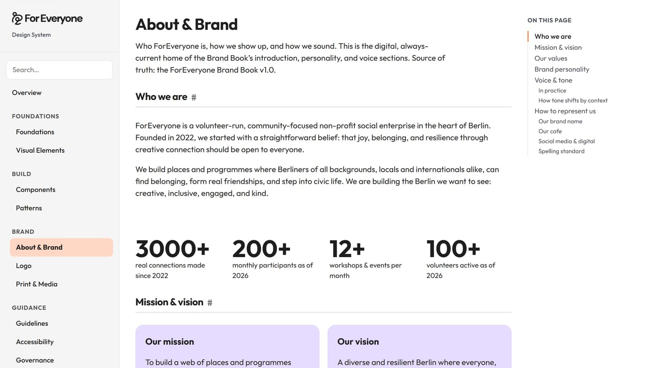
As Web Lead & Implementation for ForEveryone's 5-person web team, I build and run the WordPress marketing site. I also lead the open-source design system that the site and the Next.js web app now share. In Q3 2026 the team grew Google clicks by 44% over Q2.
The Challenge
ForEveryone ran a WordPress marketing site and a Next.js web app from a 40-page PDF brand book, while marketing shipped new landing pages every month. Colors, type, spacing, and UI patterns drifted apart, and every page re-opened the same design calls.
My Role
ForEveryone is a Berlin nonprofit that runs creative workshops and events. I build and run foreveryone.berlin in WordPress and Elementor, and set up the pipeline the web team ships pages through: SEO brief, copy, Figma design, development, and review.
For the design system, I took the brand guidelines to code: GitHub Actions, versioned releases, and tests, plus documentation that designers, developers, and AI assistants such as Claude Code and Cursor all read.
What I Did
- Built a design token pipeline: 100+ colour tokens, a 19-step spacing scale, typography, 15+ UI components, and 11 patterns.
- Published the documentation at design.foreveryone.berlin and released the system as open source on GitHub.
- Wired the same tokens into the WordPress site and the Next.js app, with accessibility standards and reduced-motion support.
- Shipped agent skills so Claude and Cursor build pages on-brand. The Messy Pottery page went live without opening the Elementor editor once.
- Added alt text and metadata to 1,400+ images with an AI agent, and fixed the redirects from the site's SEO audit.
How a token change ships
- Figma: Designers define colours, type, and spacing from the brand book.
- Design tokens: The same values live as tokens in the GitHub repo.
- GitHub Actions: Every change builds CSS variables, runs tests, and ships a versioned release.
- WordPress and Next.js: The marketing site and the web app load the same variables.
- Claude and Cursor: Agent skills read the same tokens, so new pages come out on-brand.
Results
- Replaced the 40-page PDF brand book with one reference shared by the site, the web app, and future products.
- Contributors reuse the same tokens instead of re-deciding colour, type, and spacing on every new page.
- Shipped 70 versioned releases between March and October 2026; v1.0.0 matched the brand book in full.
- In Q3 2026 the web team grew Google clicks from 1,561 to 2,242 (+44%) and website sessions by 35% over Q2. Visits from AI assistants rose from 87 to 159.
What I Learned
Most cross-functional friction comes from translating between disciplines. A design system gives designers, developers, marketers, and stakeholders a shared vocabulary for decisions, not just visual consistency. The same idea drove the block library and page builder in my parcelLab case study.